SpareVillage — UX Audit
SpareVillage is a B2B industrial e-commerce platform for spare parts and machinery. This UX audit identifies usability gaps affecting navigation clarity, product discovery, and buyer confidence.
Role
UX Designer
Industry
E-commerce
Duration
1 Week

Project Overview
SpareVillage is a B2B marketplace connecting industrial buyers with vendors for spare parts and machinery. While the platform has strong business traction, users face friction in product discovery, navigation, and trust signals.
This audit identifies usability gaps and provides actionable recommendations to improve clarity, hierarchy, and buyer confidence.
Key UX Findings
1. Navigation & Information Architecture
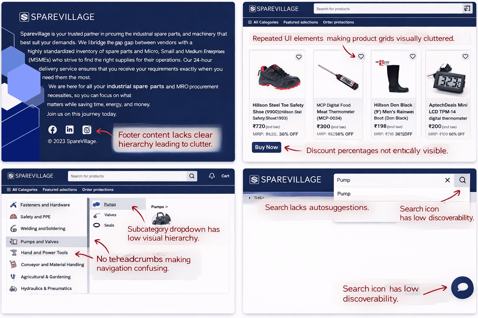
Multi-level categories are unclear and visually cluttered.
Hover-based dropdowns and no breadcrumbs reduce orientation.
Users may struggle to locate products quickly.
UX Opportunity: Add breadcrumbs, improve visual separation, reduce hover-only dependencies.
2. Search & Product Discovery
Search bar lacks auto-suggestions, category hints, and predictive results.
Search icon visibility is low, reducing prominence.
UX Opportunity: Introduce predictive search and highlight search functionality for faster task completion.
3. Product Grid & Visual Hierarchy
Product cards are cluttered: multiple pricing, wishlist, discount labels, and CTAs compete for attention.
Primary information like price and CTA lacks visual emphasis.
UX Opportunity: Standardize hierarchy — Product Image → Name → Price → CTA; reduce secondary visual noise.
4. Trust Signals & Guidance
Vendor credibility, reviews, and delivery assurances are minimal or unclear.
Microcopy and guidance for first-time users are missing.
UX Opportunity: Highlight trust badges, add inline guidance, and provide reassurance throughout the journey.
5. Footer & Support
Footer links are dense and lack hierarchy.
Key support and legal info are hard to scan.
UX Opportunity: Group links, improve spacing, and emphasize trust-building information.
Annotated product page showing cluttered hierarchy and weak trust signals ✅
Category navigation dropdown highlighting multi-level complexity ✅
Product listing grid with repeated elements and unclear CTAs ✅
Footer showing dense, ungrouped links ✅
All images include red annotations pointing out key UX issues for portfolio storytelling.
Recommendations
Improve navigation clarity and breadcrumbs
Enhance search with predictive and category suggestions
Standardize product card hierarchy for quicker scanning
Surface trust badges and vendor credibility
Group footer links and improve spacing
Impact
If implemented, these improvements are expected to:
Reduce user friction in product discovery
Increase trust and buyer confidence
Improve task efficiency for industrial buyers
Enhance overall B2B platform usability